The University of Bergen’s graphic profile consists of the profile elements listed below. By using these elements consistently and consciously, UiB will appear with a holistic and recognisable visual expression.
Name
The name Universitetet i Bergen (In English: University of Bergen) is our main identity bearer. The name tells who we are and is to be abbreviated UiB in any language.
Emblem

The emblem is UiB’s most important profile component. It shows a sitting owl above seven mountains, with the words “UNIVERSITAS BERGENSIS” written circularly in block letters.
The emblem is used alone or together with the name. The emblem in combination with the name constitutes UiB’s logo.
The emblem is a protected trademark, this makes it unique to UiB and protects it against plagiarism and misuse.
Rules for use
There is only one correct version of the emblem; it should not be changed. No additional iconography, marks or anything else may be added in direct conjunction with the emblem. Moreover, the emblem may not be collated with any forms of signature or text other than those described in the section on UiB’s logo.
The emblem can only be used in black or white (positive or negative).
It is important that there is good contrast between the emblem and the background so that the emblem stands out distinctly. The high contrast rule does not apply if the emblem is used as a decoration.
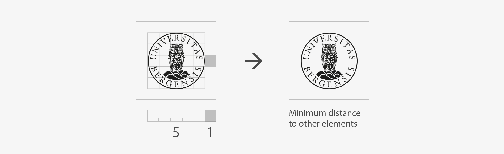
The minimum distance to other items must be 1/5 of the diameter of the emblem. The same rule applies to UiB’s logo.
About the use of logo/emblems
Download emblems
Logo
![]() UiB’s logo consists of the name (University of Bergen) integrated with UiB’s emblem.
UiB’s logo consists of the name (University of Bergen) integrated with UiB’s emblem.
The font in the emblem and name is Adobe Garamond Pro.
Rules for use
The proportions between the emblem and the name must not be changed.
The logo can be downloaded in positive and negative versions. As a general rule, the logo must be used in black or white. It is important that there is good contrast between the logo and the background so that the logo stands out distinctly.
The minimum distance to other items must be 1/5 of the diameter of the emblem. The same rule applies to UiB’s logo.
The logo is available in four variants:
Left aligned logo
![]()
Logo with name on two lines

Centered logo

Logo with initials

The name “University of Bergen” in the logo can be used alone or in combination with a department/unit. Only one specific department/unit can be used in combination with the name. The department/unit is placed under the name “University of Bergen”. If the information is provided by two equal departments/units, only the name “University of Bergen” should be used. The name of the department/unit can then be cited in the remaining text.
![]()
If you need a logo setup with the name of the department/unit, please contact the Communication Division.
About the logo/emblem
Download logo
Colours
Main colours
| #00417d
|
#009ffe
|
| rgb: 0/65/125 cmyk: 100/52/0/50 pms: 541 |
rgb: 0/159/238 cmyk: 85/21/0/0 pms: 2925 |
| #761a19
|
#ec3d3c
|
| rgb: 118/26/25 cmyk: 0/99/73/60 pms: 188 |
rgb: 236/61/60 cmyk: 0/96/82/0 pms: 185 |
In official communication from the organization, blue and red are used as the main colours. The colours can be used separately or in combination with the additional colors. Examples of use are on business cards, letterheads, diplomas and other key documents. These surfaces have a long life and should not vary too much in expression.
UiB has many fields and units, and the communication must cover various topics and target groups. In broader communication, you can also use green. Examples can be power-point, websites, video, brochures, reports, conference material, social media and advertisements.
Additional colours
| #00102a | #1d0606 | #051b0f |
| rgb: 0/16/42 cmyk: 92/73/29/79 |
rgb: 29/6/6 cmyk: 52/78/53/86 pms: black 4 |
rgb: 5/27/15 cmyk: 90/21/65/89 |
| #012050 | #300a09 | #09301c |
| rgb: 1/32/80 cmyk: 94/73/5/69 |
rgb: 48/10/9 cmyk: 27/90/62/83 |
rgb: 9/48/28 cmyk: 90/21/65/79 pms: 5535 |
| #00417d | #761a19 | #006647 |
| rgb: 0/65/125 cmyk: 100/52/0/50 |
rgb: 118/26/25 cmyk: 0/99/73/60 pms: 188 |
rgb: 0/102/71 cmyk: 99/11/72/35 pms: 3425 |
| #0175bf | #aa1317 | #058356 |
| rgb: 1/117/191 cmyk: 90/48/0/0 |
rgb: 170/19/23 cmyk: 0/100/66/42 pms: 7427 |
rgb: 5/131/86 cmyk: 93/0/71/25 pms: 3415 |
| #009ffe | #ec3d3c | #28a465 |
| rgb:0/159/238 cmyk: 85/21/0/0 |
rgb: 236/61/60 cmyk: 0/96/82/0 pms: 185 |
rgb: 40/164/101 cmyk: 84/0/74/0 |
| #65b4ff | #ff7061 | #32cd8e |
| rgb: 101/180/255 cmyk: 59/17/0/0 |
rgb: 255/112/97 cmyk: 0/69/51/0 |
rgb: 50/205/142 cmyk: 68/0/54/0 |
| #9acdfd | #ff8c79 | #8df0b5 |
| rgb: 154/205/253 cmyk: 42/9/0/0 pms: 291 |
rgb: 255/140/121 cmyk: 0/53/39/0 |
rgb: 141/240/181 cmyk: 42/0/33/0 |
| #b9ddfe | #ffb1a3 | #b1f5cc |
| rgb: 185/221/254 cmyk: 27/5/0/0 |
rgb: 255/177/163 cmyk: 0/42/31/0 |
rgb: 177/245/204 cmyk: 30/0/25/0 |
| #d1ebff | #ffdacc | #d4fce5 |
| rgb: 209/235/255 cmyk: 16/2/0/0 |
rgb: 255/218/204 cmyk: 0/20/18/0 pms: 4032 |
rgb: 212/252/229 cmyk: 21/0/17/0 |
| #eafafe | #fef9f1 | #e7fdf0 |
| rgb: 234/250/254 cmyk: 9/0/0/0 |
rgb: 254/249/241 cmyk: 0/3/5/0 |
rgb: 231/253/240 cmyk: 9/0/9/0 |
Support colours
| #eae2d5 | rgb: 234/226/213 cmyk: 4/6/10/9 pms: 7534 |
| #fff0a4 | rgb: 255/240/164 cmyk: 0/0/32/0 pms: 120 |
| #faa978 | rgb: 250/169/120 cmyk: 0/45/49/0 pms: 2017 |
| #ff80ad | rgb: 255/128/173. cmyk: 0/62/7/0 pms: 211 |
| #aaadfd | rgb: 170/173/253 cmyk: 44/36/0/0 pms: 7456 |
The support colours are used in combination with the main colours and additional colours, and should not be used as bearing colours. Examples of use may include details, illustrations, graphs and statistics. The support colors can be used as bearing colors in connection with activities in the peripheral zone of UiB’s operations. Contact the Communications Department for clarification.
Text
Text is used in one of these colours. Black and white can also be used where appropriate.
| #00102a | #1d0606 | #051b0f |
| rgb: 29/6/6 cmyk: 52/78/53/86 |
rgb: 0/16/42 cmyk: 92/73/29/79 |
rgb: 5/27/15 cmyk: 0/21/65/89 |
| #eafafe | #fef9f1 | #e7fdf0 |
| rgb: 234/250/254 cmyk: 9/0/0/0 |
rgb: 254/249/241 cmyk: 0/3/5/0 |
rgb: 231/253/240 cmyk: 9/0/9/0 |
Universal design
All web systems should comply with universal design requirements (WCAG 2.0). This means that readability on a page must be ensured by remaining conscious of contrast, text sizes and structure. Information on universal design at Difi. (external link).
Fonts
Consistent font use is essential to maintain a tidy and holistic appearance. We distinguish between the main font, secondary fonts, and substitute fonts.
Main font
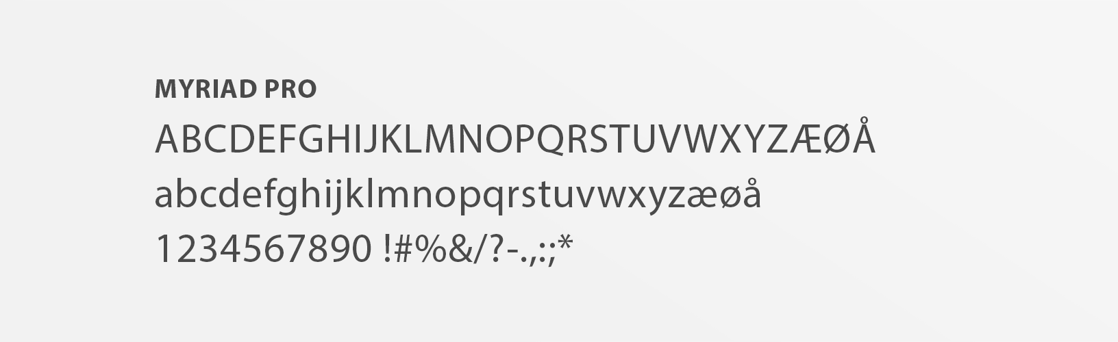
The University of Bergen’s main font Myriad Pro. Myriad Pro is used in both body text and subheadings. All variants within the typeface may be used. The type of font provides good readability on both digital surfaces and prints, and projects a modern expression.
Myriad Pro is a rental font and is usually unavailable to regular font users. There are substitute fonts you may use if you do not have access to Myriad Pro.
Myriad Pro can be used online, but it must be purchased/subscribed to. The subscription service Adobe Typekit is used at uib.no.
Secondary font
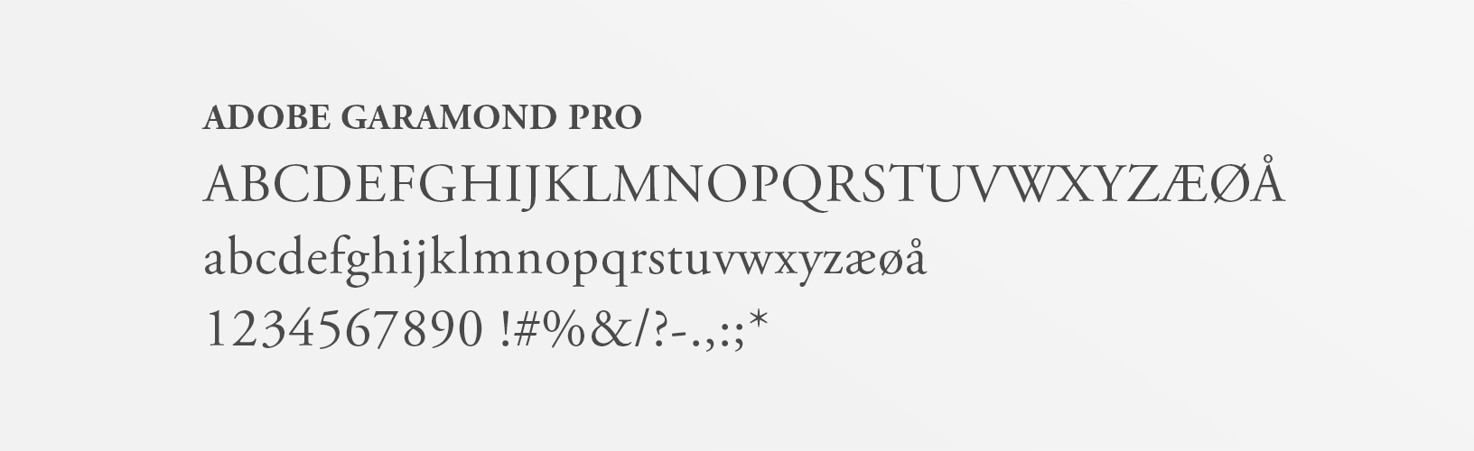
The University of Bergen’s secondary font is Adobe Garamond Pro. This font is used in headings and can be used if you want variety or contrast to Myriad Pro. All variants within the typeface may be used. Adobe Garamond Pro does not provide as good readability as Myriad Pro on digital surfaces, so it should be used only for details and brief texts.
Adobe Garamond Pro is used in UiB’s name and emblem.
Adobe Garamond Pro is a rental font and is usually unavailable to regular font users. There are substitute fonts you may use if you do not have access to Adobe Garamond Pro.
Adobe Garamond Pro can be used online, but it must be purchased/subscribed to. The subscription service Adobe Typekit is used at uib.no.
Substitute fonts
In normal use the main font and secondary fonts can be replaced with substitute fonts. Myriad Pro is replaced by Calibri and Adobe Garamond Pro with Times New Roman. The substitute fonts are standard fonts that exist on most machines irrespective of operating system.
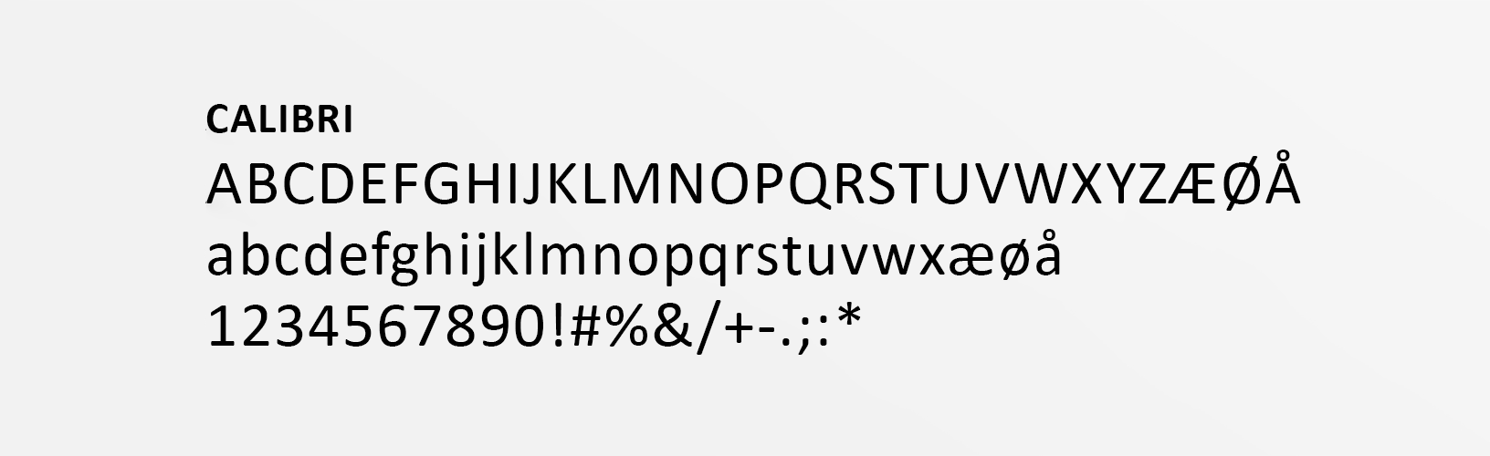
Calibri is used as a substitute for Myriad Pro. In most cases, Calibri is used in both headings and body text.
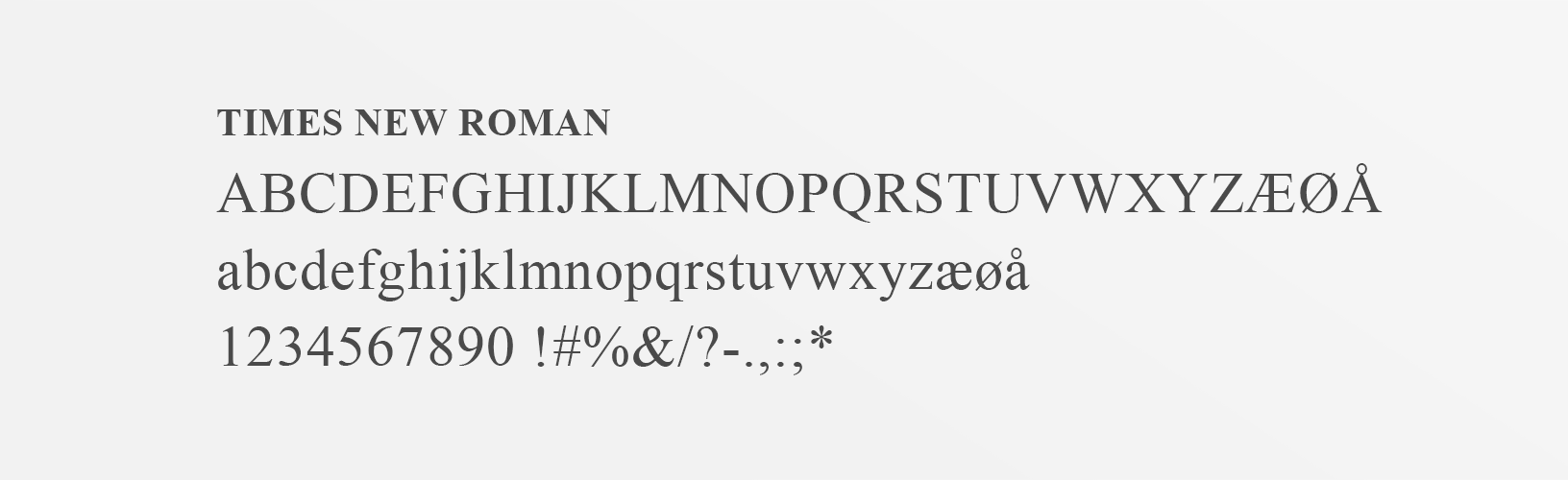
Times New Roman is used as a replacement for Adobe Garamond Pro. Times New Roman can be used if you want variety or contrast to Calibri.
Substitute fonts for digital surfaces
A general rule on PC monitors is that the font size should be large enough to yield good readability. There should be good contrast between text and background colour.
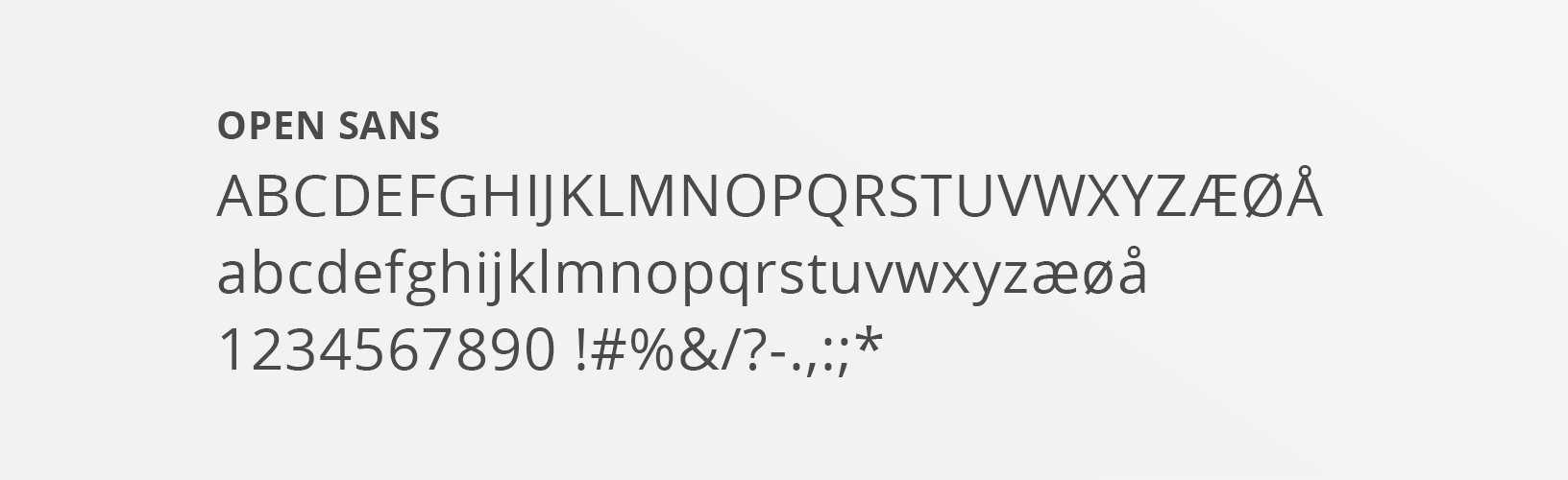
On digital surfaces, Open Sans is the substitute font for Myriad Pro. Open Sans can be used if Myriad Pro is not available. The font provides good readability and is designed to work on screen displays. Open Sans is a Google font that is free and openly available here.
In most cases, Open Sans is used in body text, titles, and menus.
Times New Roman is used as a replacement for Adobe Garamond Pro. Times New Roman can be used if you want variety or contrast to Open Sans.